
Hues in control: Taking charge of colour management
There are now more surfaces than ever before for your photographs to be published on, across the digital and print spectrum. Consequently, it’s imperative for photographers to really understand colour management. Christopher Quyen spoke with leading experts and photographers to learn the secrets of mastering the craft of colour.
Colour theorists often speak about how each individual perceives colour differently. While this may seem a bit far-fetched, a viral picture of a dress in 2015 did spark an online debate that divided scientists and netizen’s opinions on whether the dress was white or blue. In short: the human eye is not as accurate as we may think it is. To understand how important colour management is, all you have to do is walk into any tech store and look at all the screens and devices on display. Immediately, you’ll notice that each screen has its own unique way of interpreting and displaying colour. Now, none of these screens are professional monitors designed to present you a visual as close to the original image, but the reality is that there are so many different outputs for our imagery nowadays from screens to merchandise to print.

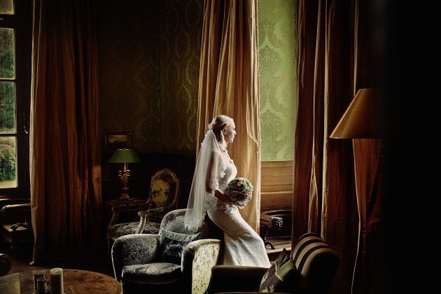
Post production – Rohner Retouche.
Internationally respected colour expert, Dr Les Walkling calls this “the Harvey Norman effect”, and for any professional who does not care much for colour management, this alone should be the wake-up call to start learning. “While there is not much we can do about how all these different devices interpret colour, the least we can do is manage both the colour profiles of our hardware and software, and the colours of our files to be specifically displayed on those devices,” says Walkling. “There has never been a better time to begin taking colour management seriously.” Luckily, photographers are able to rely on a variety of tools that are designed to ensure that the colours in their images are as close to reality as possible.
Fitting into the Spectrum
Before you dive into colour management, it is worth trying to first gauge the extent that you have to be involved in the inevitable process of the colour management of your workflow. According to Walkling, not all of us need to be buying entry-level colour management tools, wasting countless hours printing, experimenting, and creating unique colour profiles for different papers as there are services that can provide printer profiling or photo labs that can achieve a beautiful print for you by adapting their workflow and printer profile. For photographers, time is money and some may just want to be confident in the colours their cameras are capturing, or the colour accuracy of their monitors. Ultimately though, colour management and digital imagery are intertwined, and it is important to safeguard and protect yourself from the possibility that the end product will be a disaster. So, identifying possible colour issues in your workflow is a good place to start.
Refining from the Raw
The first step most people take in colour management is going into their camera settings and shifting the colour profiles to ensure that their images look right in-camera. While this may be enough for a JPEG workflow, it does not provide the flexibility that comes from shooting in RAW, which contains all the information recorded by the image sensor during the capture. Phoenix-based commercial food photographer, Joanie Simon says that this flexibility is integral to her workflow especially when it comes to replicating the colour of food. “Food photography sets can be busy, especially on location at restaurants, and distractions happen, so having a lot of room for forgiveness in post is essential. I generally will set white balance based on the scenario and the light that I’m using, but again, if I forget to adjust white balance at the start of a shoot, that’s why RAW can be a lifesaver,” says Simon.
When working with a RAW workflow, shooting a frame with a colour checker card such as Datacolor’s Spyder Checkr or an X-Rite ColorChecker Passport also helps Simon be more efficient in her editing process. “I find it saves a lot of time and removes the guesswork if you have a tool to ensure colours are properly balanced,” she says. Taking the time to use a colour checker card during a shoot also brings with it the added benefit of aiding photographers to create custom input profiles for their cameras and editing software. “It may take time creating a custom input profile for every shooting condition, but when you’re working in Lightroom or Photoshop it increases the overall fidelity and accuracy of your recording and also gives you a massive head-start in the amount of post processing you have to do to get your images to a high standard,” says Walkling.
Monitoring Monitors
Out of all the things that could shake a photographer’s confidence, seeing the colours of their image appear entirely different on their laptop, desktop, and high-end monitor is definitely one of them. The need to calibrate your monitors should be at the forefront of your mind. But before you even begin, it is important to ensure that your monitors are in suitable environments for editing, suggests Germany-based wedding photographer, Firat Bagdu. “When I set up my workspace, I made sure that I diffused the lighting in the room and that no direct light fell on the monitor,” Bagdu says. While many high-end monitors come with a hood to protect the screen from direct light and in-monitor software to manage the effects of ambient light, the reality is that ambient light can affect the way colours are perceived on your display, so controlling the light in your workspace is an important first step in colour management.
Once you have a suitable working environment, choosing a high-end monitor or calibrating and profiling your existing one is the next step. Swiss commercial photographer, Jonathan Heyer who uses one EIZO ColorEdge CG319X (4K hardware calibrated) monitor in the studio and two EIZO ColorEdge CG247X monitors on location, has seen professionals shoot their work on expensive equipment, but then edit their photos on an uncalibrated or colour-inconsistent monitor. “Without a colour-consistent monitor, all creative work is worth nothing, because you do not see what you are doing,” he says. For Heyer, a good workflow for colour management is to calibrate and then profile. “Just to break it down, calibration is the setting of the monitor to the desired standard values. There are three parameters to consider: brightness, white point, and gamma. Profiling is the measurement of the colour gamut of the monitor and then at the end of this process is the monitor (ICC) profile,” explains Heyer. Simon also says that understanding the file settings such as the colour profile is important. “The general standard for online image sharing is the sRGB colour space which is perfect for consideration of the colours available through most standard monitors. But, for printing, it’s best to take advantage of the wider colour profile available in Adobe RGB (1998) or other similar profiles,” she says.
So why should you pay a premium for high-end monitor brands including EIZO and BenQ? WA-based landscape photographer Tony Hewitt’s career spans almost three decades He works using Capture One to create 16-bit TIFF or PSD working files, colour profile produced by Joseph Holmes, for enhanced colour flexibility, and EIZO monitors, including a ColorEdge CG277 and ColorEdge CG245W. It’s his view that the uniform brightness alone in high-end monitors is worth the extra cost. “I use EIZOs which have built-in software like ColorNavigator 7 and are also self-calibrating to maintain colour accuracy and tonal accuracy. The self-calibration feature ensures the screen colour management is always up to date and that they are colour consistent from corner to corner,” says Hewitt.
Tools of the Trade
But if purchasing a high-end monitor is not an option, or if you have multiple screens that need to be colour managed, choosing a colour calibration tool, or colorimeter, such as an X-Rite i1 Display Pro, Datacolor Spyder5Elite, or basICColor DISCUS are all good options to achieving consistency. It is also important to note that each device has their own approach when it comes to calibrating. For example, a laptop will have to be calibrated at maximum brightness as they are being used in continuously changing ambient light conditions, while a desktop will use the room light sensor found on colorimeters to measure the ambient light and adjust the monitor’s brightness settings accordingly. Projectors, on the other hand, involve the linearisation of primary colours which ensures that the correct colours and densities, especially in shadow areas, are being shown. With all these tools in your hands, Simon recommends that you calibrate your monitors at least once a month, if not fortnightly.
When it comes to the physical delivery of your images ensuring that your clients receive a colour-accurate print is often the last step for professionals. Soft-proofing your images on your monitor and viewing them in the correct colour space is thus another important step to ensure that your prints will be accurate. “Check your paper profile to see if it can handle your colour choices. Ensure you are using a correct paper/printer profile,” says Hewitt. “It’s also best to have custom profiles made to your system/printer/paper, otherwise there are generic profiles downloadable from the printer manufacturer’s websites.” Simon reiterates the importance of this, especially since prints aren’t just made to paper or canvas, but also to packaging and merchandise. “You owe it to the client to capture their product in accurate colour. Images I have taken end up on packaging that gets distributed throughout the US, and if the colours are incorrect, this can be a monumental issue,” says Simon.

Thinking about Print
Profiling printers using spectrophotometers such as Datacolor’s SpyderPRINT or X-Rite’s eXact Standard spectrophotometer is also a necessary step if you decide to offer prints as a part of your business, rather than using a photo lab. With a spectrophotometer, you will need to make test prints of colour patches and create different profiles for each type of paper you print on. However, Hewitt admits that colour management of printers is a whole other skill set that requires time and patience to learn, and some photographers may not have time for that. “If this is not your forte, you may be better advised to enlist the services of a local expert. These services are often available from professional photographic suppliers. This will allow you to concentrate on the creative process,” says Hewitt.
Walkling also recommends professional assistance, especially when it comes to profiling printers. “Printer profiling is very complicated for so many reasons, and it’s usually creative, more than scientific, because you are getting the printer to interpret and reproduce a colour in a very specific way. An easy way to think about it is that if I send a photo to my printer which is set to 20% on the reds and the reds come out looking 20% more saturated on the paper I’m using, what I would do is change the custom profile of my printer to lose that 20% red when it prints on that paper,” says Walkling. But for photographers who decide to stick with photo labs, it may be a good idea to ask your lab about how you should provide your files to ensure that they can get the best print.
The Final Frontier
The reproduction of reality is something that has captured our minds since the inception of photography, but in the digital age, colour management is something that every serious photographer need to pay the attention and focus it deserves. Walkling notes that colour management is in an interesting space right now. High Dynamic Range monitors and televisions that can accurately reproduce the colour and dynamic range in shadow and highlight detail are being developed, and there is a movement of colour experts and photographers creating colour input profiles not to produce accurate colours, but rather colours that evoke the same emotion and feeling they got from what they personally saw when they captured that image. But the bottom-line is that we are surrounded by so many tools and devices that allow us to be accurate in reproducing colour that ignoring it is not an option anymore. As Walkling says, colour management is like the veins that carry the blood throughout in our digital imagery, and if we’re not actively taking it into consideration then we are at risk of having the final vision of our work caving in on us.
Colour management workflow
|
1. Shoot in RAW and capture different lighting conditions with a colour checker card for correction during post production. |
|
2. Set up your workspace to control ambient light. Angle your monitor away from windows, draw your blinds, and keep a hood on the screen. Turn off bright ambient lights that may reflect off your screen. |
|
3. Calibrate monitors and printers regularly using good quality colorimeter and spectrophotometers, or engage the services of a reputable third party. |
|
4. Create custom profiles for your printers to achieve the best results using a variety of paper stocks, as required. |
|
5. When preparing your images for print, ensure you do a soft proof on your calibrated monitor to avoid nasty surprises. |
|
6. Make test prints and tweak images, if necessary. |
Contacts
Firat Bagdu www.bagdu.de
Tony Hewitt www.tonyhewitt.com
Jonathan Heyer www.jonathanheyer.ch
Joanie Simon joaniesimon.com
Les Walkling www.leswalkling.com

Get more stories like this delivered
free to your inbox. Sign up here.