
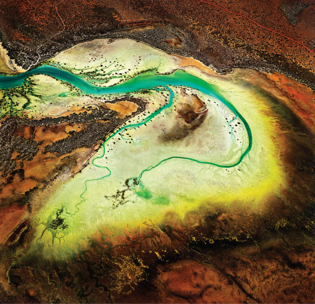
Cracking the colour code
Technical, philosophical, potentially beautiful and definitely important. Proper colour management is a lot like the art of photography itself, and without best practice in your studio, you could easily find yourself in a spot of bother, writes Lyndal Irons.
Colour perception is an illusion. That is, colour sensation only exists in our thoughts and perceptions, says Dr Les Walkling, a respected International leader in the area and Australia’s foremost colour expert.
Since the introduction of digital cameras, photographers have tried to control the slippery concept of colour management in order to consistently represent subject matter the way it was intended. At worst, bad management can foil the very purpose of a photo shoot, misrepresenting brands and thwarting expectations. While there are plenty of occasions in professional photographic practice when creativity benefits from chance, colour needs to be predictable from the time of capture to print. That means seamless control over all tools of the trade. But as perception differs greatly between humans, how can computers, cameras, printers, scanners and monitors of varying brands come to the same conclusion about what is red and what is pink?
While colour itself is not a quantity that can be standardised, the conditions of its production and reception can, says Walkling. Colour profiles take out much of the guess-work involved in processing colour and hand power back to photographers by eliminating uncertainly. They act as a set of instructions about how colour should be interpreted by different hardware and software. To ensure consistency across the full entourage of mechanics used in photography, everything needs to be profiled: cameras, lighting conditions, monitors, printers. A break in the chain can render the rest useless. So professional photographers have little option but to pay attention to this area of their workflow.
“[Colour management] is not an add-on or an extra,” says Walkling. “It is the ‘heart and soul’ of digital imaging. Ignorance of colour management doesn’t mean you aren’t working with colour management, nor a colour managed system. It just means you are letting someone else make those critical calls for you. The benefits of taking responsibility for this is meant to translate into more efficient, accurate and repeatable workflow, increased production, increased earnings, professional confidence and assurance, and less time worrying about such things.” So where should one begin fixing the weakest links of your own workflow?
Gaining control
The good news is that getting it right in camera is relatively straightforward. “If you shoot RAW, you’re effectively postponing your colour management till later when you’re processing your images, as the RAW data is just the data from the sensor, and it doesn’t have a defined colour space as yet,” says photographer, educator and retoucher Tristan Still who works at Sydney-based image production company Electric Art.
When shooting RAW, a quick reference frame using a colour checker card such as those from Datacolor (SpyderCHECKR) or X-Rite will set you up for a smooth, accurate workflow later on. X-Rite’s ColorChecker card contains 24 scientifically prepared squares of colour representing natural objects such as skin, foliage and sky. Capturing this in camera means it is easy to create industry-standard profiles for specific conditions using readily available software. This is the approach taken by many photographers, including Sydney-based wedding photographer Daniel Griffiths who always shoots with a ColorChecker in tow. He uses it to ensure accuracy, but it has an added bonus of drastically reducing his time in front of the computer.
“I try to do my editing at the shoot by getting the colour right on the day,” he says. “When you get back [to the studio], you don’t spend time correcting for blues, warm colours, or greens inside churches.”
Editing
Once the image is off the card and into the editing room, there are more things to consider. All professional-level programs now support colour profiles. It’s up to photographers to pick the right profile for the end purpose and to make sure the software in use is abiding by that decision. Setting up your RAW processor to process directly into the colour space you want to work in is a good first step, then ensure that your image editing program will preserve embedded profiles for files that you open. Choosing the right colour space depends on many factors, including your final output destination. If you are uncertain, Adobe RGB (1998) is a safe fallback for most purposes, but there are advantages to gaining confidence in using larger, custom made profiles. However, you might discover that your pro-lab prefers to print images embedded with an sRGB profile, so it’s always advisable to check.
Tristan Still uses a specially designed set of profiles of varying gamut, each one slightly larger than the previous, so that he can always pick the one most appropriate to each image to avoid saturation clipping and posterisation when editing. “My chosen RAW processor has a saturation clipping warning, so I don’t have to check the histogram for clipping in any channels while trying to find the most appropriate profile to use. All the profiles I use share a perceptually linear tone curve to make editing tone more intuitive by equating equal steps in value with equal steps in brightness, which effectively makes editing shadow detail in very dark images easier. Once you’ve found an appropriate profile for your image, make sure you save with it embedded in your file, otherwise the whole exercise of colour management is pointless,” he says.
Monitors

Having a high-end, calibrated monitor is non-negotiable for those serious about their work. Rob Gatto from Kayell Australia says one common mistake photographers make is editing photos on a laptop screen without understanding the restricted gamut and the impact of the changeable angle of view. He recommends programs like Color Think to understand the gamut of your monitor, image and output device before editing. “For a little bit more money, all photographers should look at their monitors and think of how important it is to have one that is made for retouching images not just doing e-mail,” he says.
It was a lesson Daniel Griffiths wished he had learned earlier in his career. “I went through phases of buying cheaper monitors. I upgraded in stages and this cost me a lot of money. You end up dissatisfied, and if you just spend the money in the first place, you can save a lot of headaches, too.” He now owns four EIZO monitors including two ColorEdge screens with inbuilt calibration systems that turn on, warm up and calibrate to a schedule without any thought required from the photographer. There is no question in his mind about whether it was worth the investment. “This is such a massive part of photography. There are so many photographers who don’t use high-end monitors but it is critical for colour, tone, hues, shadow and highlight detail. It’s as essential as having a light meter in your camera.”
The 2013 AIPP Australian Professional Photographer of the Year, Tony Hewitt, also favours EIZO. Hewitt processes in Capture One, moving into a larger Joseph Holmes profile from a RAW file. He uses EIZO monitors because they have consistent colour across the screen from edge-to-edge. “At the end of the day, if the print looks good to the eye, then it’s rarely ever going to cause an issue with the client,” he says. “In portrait photography, I may want warmer images. Sometimes true colour on a photo looks too cold. It’s contextual. But when I push my colours, it is with a deliberate intent to emphasise an emotional quality I’m responding to. If my colour isn’t exact, then it’s because I’ve chosen it to be that way.”
One of the best parts of investing in a high-quality monitor is the included software. Tristan Still believes it is often far superior to the software bundled with a monitor calibration device. He also recommends the BasICColor Discus – a mid-range calibration tool that is changing the market. “In a class demonstrating monitor calibration, I once compared twelve new identical monitor calibration devices of a common and highly-regarded brand. I discovered 10 out of 12 of them were clearly flawed, providing either a pink or green-hued result, and in two cases, a fluorescent pink result. These devices are the key that you trust for your colour, and over 80 per cent were wrong! The BasICColor Discus, while certainly expensive, fills a gap between the cheap $150 colorimeters and the extremely expensive high-end colorimeters used at the factory to calibrate colour critical monitors.”
High-end monitor manufacturers including EIZO, BenQ and NEC are aware of the increasingly diverse hats worn by photographers using their monitors. Features are appearing that allow photographers to easily switch between settings depending on whether they are editing for print, video or web. While EIZO has been around for a long time and appears to be favoured by the photographic industry, other companies are getting increasingly competitive. BenQ’s PG2401PT pro graphics monitor was developed with X-Rite to deliver a complete solution to photographers at a lower price point. Their BL2710PT monitor also has Presentation Mode which emulates the brightness and colour reproduction of a projector via the monitor so presenters are able to work with the file and know exactly what will be projected.

Printing
Printers need profiles too, and this step can sometimes be overlooked. These can be created using spectrophotometers of varying quality.
“The handheld spectros some companies use are okay to create printer profiles,” says Gatto, “but at Kayell we use a device called a Barbieri LFP transmission/reflection spectrophotometer, which measures patches on a XY table and enables us to add UV filters, Polarization filters and we can also take multiple samples from a patch. Without a doubt, it is the best device to make printer profiles. It can also take larger apertures to measure canvas and courser materials to help in the profile creation.”
While printing in-house “closes the loop” in colour management and offers supreme control over the entire process, it can be difficult to master the perfect workflow as the file passes through multiple steps before reaching the paper – each prone to error. Imaging programs, un-embedded profiles and printer drivers can change the colour profile of your image if you are not paying attention. One user-friendly option for photographers who want to print in-house is to invest in a Raster Image Processor (RIP) software package. Essentially a specialised, colour-managed printer driver and print layout program in one, a RIP makes it extremely easy to handle colour management for your prints and produce consistent and predictable results – and it is not dependent on the underlying operating system. RIPs do not support all printers but that is because they are extensively tested with the models they do support, and highly accurate profiles can be generated and provided with the software. However, they are not perfect, with many designed to reduce the gamut to emulate a printing press. “Though its interface is somewhat archaic, I have found the RIP ImagePrint to produce exceptional prints, and colour management is easy, as it will use the embedded profile of anything you throw at it,” Still says.
For photographers relying on external printers, he recommends asking a few simple questions to determine if you can trust them with your files. “Good places will detail their process to you, and provide clear instructions about how to provide files, as well as provide profiles for soft proofing, so you can see exactly how your files will print. Sadly though in my experience, very few commercial labs in Australia handle colour in an ideal way, though that doesn’t mean you can’t get a good print.”

Be in the know
Setting up your colour management takes time and money to begin with, but unfortunately there are few other options. “If you try and take a shortcut, it short-changes you,” says Walkling. “Calibrating your monitor without knowing what ISO standard you are calibrating to and why, results in the ‘blind leading the blind’, and in a visually-centric medium like photography, that is not helpful. Calibrating your monitor and not calibrating your printer to the same condition also makes no sense at all, because what then is your screen referring to? And not calibrating your camera means that you have to manually apply the same base corrections over and over again to every file, which is a crime against efficiency and sanity. Working on a calibrated monitor in an environment that doesn’t match the same standard is also optical madness. You need to know a bit about everything in order to know anything at all. Such is the interrelatedness of every aspect of our digital imaging workflow, and colour management is as fundamental as f-stops and shutter speeds,” Walking says.
As screens (mobiles, tablets, etc.) become ever more prevalent, it becomes increasingly obvious that remaining ignorant about colour management will not make it go away. Experts agree that the best defence is knowledge. “The most important thing is to get educated,” says Still. “When colour management features were first introduced into Adobe Photoshop, most people turned them off because they didn’t understand it, and it made the colours of their images look ‘strange’. At that time, colour management and the hardware technology was still developing, and a lot of things didn’t work, so people understandably didn’t trust it. The technology has developed to a point now where it is very capable, and demonstrably capable. Now we don’t have an excuse to ignore it. We need to actively embrace it, and part of that is learning about how it works, and how it can work for you. It’s worth it,” Still says.
Educate yourself
Monitor calibration www.leswalkling.com/texts/monitor.pdf
Soft-proofing theory www.leswalkling.com/texts/softproofing.pdf
Cambridge in Colour www.cambridgeincolour.com
DigiPix manual www.eci.org
FOGRA Softproof Handbook www.fogra.org
Contacts
Daniel Griffiths dgphotos.com.au
Tony Hewitt www.tonyhewitt.com
Les Walkling www.leswalkling.com
Electric Art www.electricart.com.au/index.php
Kayell Australia www.kayellaustralia.com.au
Barbieri barbierielectronic.com
basICColor basICColor.de
CHROMiX, Inc. chromix.com
Datacolor datacolor.com